Disparities in Wealth & development
Millennium Development Goals - After the deadline based on geographypods.com
Objective: To examine the progress made in meeting the Millennium Development Goals (MDGs) in poverty reduction, education and health.
Starter: Check out this infographic. What patterns do you see?
We will focus in on goals 1, 2, 4, 5 and 6 only. You will be working individually to create a presentation that outlines the progress made so far and whether your allocated goal was met. You will be assigned a group for goal 1, 2, 4, 5 & 6.
Study the MDG Progress Report below. You might want to download your own copy here and save.
Task 1 - The first task requires the use of a site called Wordle. It is a great tool for extracting key words from large bodies of text. It works by simply copying and pasting a block of text into it, and the rest is taken care of. Click here to be taken directly to the site.
i. Open the MDG progress report and scroll through to your goal and copy and paste the text into a Wordle. You should get something that looks a bit like this. Copy the Wordle/screenshot it onto your worksheet and write up your commentary on the main words and themes covered.
Task 2 - Now you are ready to start your presentation. You can use your worksheet above to record an overview of information. The PowerPoint outline is here. Add to this, or remove sections as you see fit.
**Excellent Resource** - September 2013 - Collection of articles from the Guardian - This will help you to evaluate progress on goals, 1, 2, 4 & 6.
Additional Resources for Task 1
Goal 1 - Impact in India & Impact on Sub Saharan Africa (2013 - How to solve these issues Red Cross article). This data visualization was released in October 2013 too and could be used to state the overall pattern of extreme poverty.
Goal 2 - Impact in Tanzania
Goal 4 - Impact in Brazil & BBC News Report from May 2013
Goal 6 - Impact in Russia
Task 3 - Complete an extended piece of writing (60 Marks - assessed using Paper 1 rubric)
Explain why there has been uneven progress in meeting the MDG's for poverty/education/health.
Use case study countries throughout and comment on the ability of regions to meet these goals (see link on Sub Saharan Africa above)
End with a conclusion about whether the goals have been fully or partially met now that the deadline has passed. Were there any factors that were not considered in 2000 when the goals were set? Think carefully about the ongoing global recession.
Life Expectancy, Income & Education - trends in inequalities - based on goegraphyalltheway.com
The aim of this lesson: To be able to identify and explain patterns and trends of regional and global disparities of life expectancy, education and income.
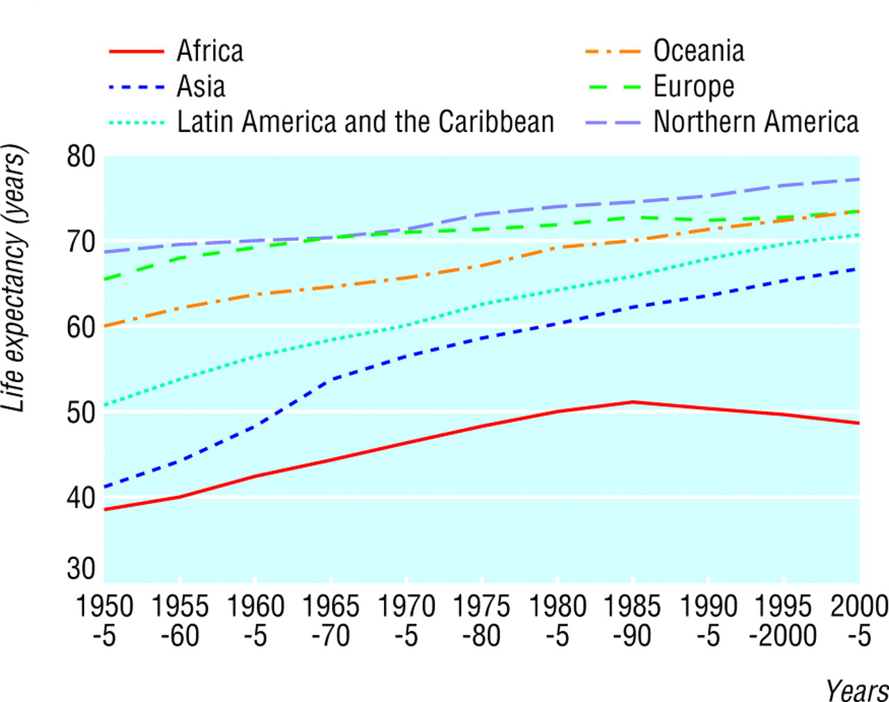
Task 1 - Life Expectancy - Answer the following question based on the graph below.
Remember - trends can be seen in statistics and patterns are more geographically located.
The aim of this lesson: To be able to identify and explain patterns and trends of regional and global disparities of life expectancy, education and income.
Task 1 - Life Expectancy - Answer the following question based on the graph below.
Remember - trends can be seen in statistics and patterns are more geographically located.
- What is the overall/global trend in life expectancy shown in the graph below?
- Brainstorm reasons for the global trend you have identified.
- For each of your reasons - go further with research to develop your notes past generalised. 'Improved Healthcare' isn't satisfactory - what element of 'improved healthcare' has caused life expectancy to increase?
- Identify and suggest reasons for the anomaly on the graph.
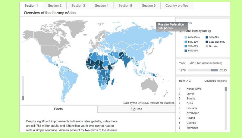
Task 2 - Education - Answer the following questions based on the this link.
Despite significant improvements in literacy rates globally, today there are still 781 million adults and 126 million youth who cannot read or write a simple sentence. Women account for two-thirds of the illiterate population, according to the latest data from the UNESCO Institute for Statistics (UIS).
The UNESCO eAtlas of Literacy lets you explore and adapt maps, charts and ranking tables for indicators covering the youth, adult and elderly populations. Indicators are disaggregated by sex to better evaluate gender inequalities.
- What is the overall/global trend in education shown by the visualization reached by clicking on the link? (use the Year slider to see changes over time).
- Can you name an example that has shown a rapid increase in education? Suggest reasons for the rapid nature of the increase.
- Can you name an example that has shown a decrease, either overall or for a period of time, in education? Suggest reasons possible reasons for the decrease.
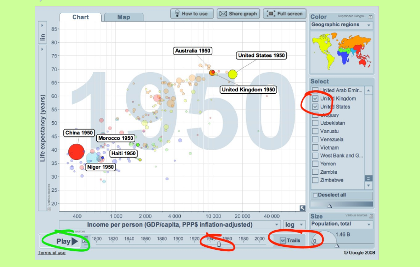
Task 3 - Income - Answer the questions below based on the animated graph in this link.
Using an example at a regional scale, explain the changing patterns and trends in life expectancy. [6 marks]
Explain the trends seen in the global disparities of income. [6 marks]
Explain either the patterns in regional or global disparities in education. [6 marks]
- Open gapminder.org and have a play with the life-expectancy versus income visualization. Set it up like you can see in the image below.
- What is the global trend in income since 1950?
- Press play so that your graph produces trails for the IB Geography 5 countries.
- Draw the trails on the blank graph.
- Annotate your graph with suggested reasons for the increases and decreases in income, for the individual countries of the IB Five.
Using an example at a regional scale, explain the changing patterns and trends in life expectancy. [6 marks]
Explain the trends seen in the global disparities of income. [6 marks]
Explain either the patterns in regional or global disparities in education. [6 marks]
ORIGINS OF DISPARITIES - ZIMBABWE - Based on geographypods.com
Objective: To be able to explain disparities and inequities that occur within countries resulting from ethnicity, residence, parental education, income, employment (formal and informal) and land ownership.
We will be using Zimbabwe as our focus case study for this piece of work. It is a country that does not form part of our core focus, but we can apply much of this unit of work to it.
Stop Check - Use the Google Map beneath to locate and explore the country. Use the CIA World Factbook as well to get the key facts and figures.
a. How many countries does Zimbabwe share a border with?
b. What is the capital city?
c. Who is the leader of the country?
d. HDI ranking is? (what are the component values of the three sub-indicators?)
Your Task - You will be working in pairs. You will be putting together a written report about the origins and disparities of land ownership, residence, income and ethnicity in Zimbabwe. (We will be covering parental education later). You can do this using a shared Office 365 document.
Part 1 - Brief History of Zimbabwe.
Gapminder - Check this out first. Press play for GDP & Life Expectancy plotted from 1800 onwards. Look closely at 1987 onwards (election of Robert Mugabe).
You will need to write an introduction of approximately 200-300 words outlining the history of Rhodesia/Zimbabwe. This BBC timeline will help you. You need to provide a summary of the levels of prosperity experienced in Zimbabwe as well as the presidency of Robert Mugabe and descent into hyperinflation and extreme unemployment. Information on the August 2013 election can be found here.
Part 2 - Land Ownership & Residence
You will need to conduct some in-depth research into the land reform policy (Wikipedia entry for Zimbabwe) in Zimbabwe. Start off by studying this article (2002) from the BBC. Then move on to this more recent BBC News article from 2011 that gives you some nice visualization graphs half way down.
Part 3 - Ethnicity
Then you will need to conduct some research into the recent battles to gain control of the farmland between the white farmers in Zimbabwe and the black population.
There is an excellent film entitled Mugabe and the White African. You should both watch this if you can find a copy. Here is a (biased) documentary produced on Mugabe and Zimbabwe which you may find useful. Or here is a news report from Al Jazeera English. Finally, another (biased) documentary produced on white farmers in Zimbabwe.
Make sure you carry out additional research being careful of bias.
Part 4 - Disparity in Income & Employment
i - Start off by clicking here and reading this 2015 article about the problems caused by hyperinflation in Zimbabwe. Make sure you explain what this means and the effects that it had on the general population as well as the measures being taken to stop it.
ii - Employment disparity information in Zimbabwe is here. Then Click here to watch a BBC news report about the disparities in income that exist now in Zimbabwe. Take notes and follow this up with further research and mapping of areas that show disparity.
Part 5 - Parental Education (Higher Level Students):
i. Make a note of this. Parental education: If your parents are educated it is more likely to mean that they have a good job and can afford all of life's needs (housing, food, etc.). If your parents are employed it is also more likely that they can afford to send you to school giving you a head start in life. You may think of your situation and compare to that of a child in one or our case studies in Zimbabwe, Afghanistan etc.
ii. Read this BBC news article and highlight the key data that was recorded on this study in the United Kingdom (October 2013)get a feeling for the issues caused by parental education and likely successes of children in school.
ii. Now click on this PDF document. Take time to read the Preface on page 10 and Introduction on page 12. Then skim read pages 27 (Impact of Colonialism on Education) to page 37 taking key facts and data.
iii. Now check the literacy rate of Zimbabwe today and make a note of it. From what you have learnt, write a summary of what likely disparities exist dependent on parental education and if these have got better or worse since decolonization in 1980. Perhaps you want to visit Gapminder and trace literacy rate over time?
Part - 6 - Summary and evaluation time.
What does the future have in store for Zimbabwe. Is there any fast way back to the level of development that the country previously experienced? To what extent can it be considered a periphery country?
COMPOSITE MEASUREMENT INDICATORS
Objective: To be able to define the key components of the Human Development Index and to identify patterns and give detailed explanations for its global spatial pattern.
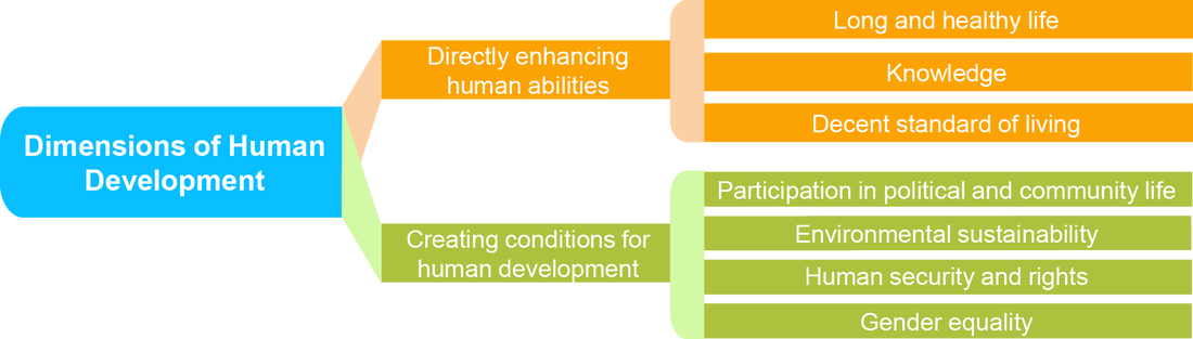
Task 1a - Listen to the embedded talk below and make notes on what human development means. Make notes on the limits of measuring human development as well as integrating the graphic below into your work.
Task 1b - Using a trusted source, define carefully the Human Development Index. Don't forget to include the key components and how it is measured as well as when and why it was set up.
Objective: To be able to define the key components of the Human Development Index and to identify patterns and give detailed explanations for its global spatial pattern.
Task 1a - Listen to the embedded talk below and make notes on what human development means. Make notes on the limits of measuring human development as well as integrating the graphic below into your work.
Task 1b - Using a trusted source, define carefully the Human Development Index. Don't forget to include the key components and how it is measured as well as when and why it was set up.
|
Task 2 - What are the limitations of HDI? Click here to be taken to the UNDP site. Read over the information here and summarise the importance of 'the dis-aggregated HDI'. **This page is also available in Spanish and French**
Task 3 - Mapping HDI. Click here to be taken to the UNDP site that shows the spatial distribution of levels of HDI. a. Write a piece of commentary that describes the variation and spread of HDI today, including reference to the main IB focus countries . Record the HDI values of each country in your book or online document and make them stand out. You will be expected to remember these values for the final examination. Include a copy of the embedded map for reference purposes. b. Write about the highest and lowest placed countries on the most recent report (you may want to watch the satirical video on Norway underneath - number 1). |
|
Single Index Measurements
Task 1: Define the following terms in your notebook: infant mortality rate; literacy rate; education expenditure; malnutrition prevalence, height for age (% under 5); gross national income.
Task 2: Use the attached map and table to collect recent data for an index of infant mortality or education or nutrition or income. Use the data to produce a choropleth map.
Task 3: Brainstorm the value of the indices in measuring disparities across the globe - are some better than others, how difficult are the data sets to collect?
Advice on choropleth maps:
Thematic Cartography Guide
How to Make a Choropleth Map
Task 4: Collect and learn an index of infant mortality, education, nutrition and income value for the IB Five countries.
